


Empathize
Understanding User Needs
To try and improve our credit application’s completion rate, we collected data by:
- Gathering metrics on bounce rate and time spent on page
- Collecting feedback from users via a user survey (both app abandon and post-completion)
- Watching videos of users interacting with the credit application
Define
Pinpointing the Problem
We consolidated the research and created the following business objective
- Problem statement: Users feel the application is too long and confusing. They also think it asks for personal information that isn’t relevant.
- Experience review: The fields in the application didn’t seem grouped logically. Several sections took up a lot of space visually and didn’t seem important to the application process.
Ideate
Generating Solutions
Worked with credit, marketing, product, and compliance teams to brainstorm solutions. We talked through:
- Some personal information fields may no longer be necessary to make a credit decision.
- The web account setup, paperless statements signup, and credit insurance add-ons could be moved until after the application results page.
- If we added a step at the beginning capturing just the email address, we could remarket application abandoners.
Prototype
Bringing Ideas to Life
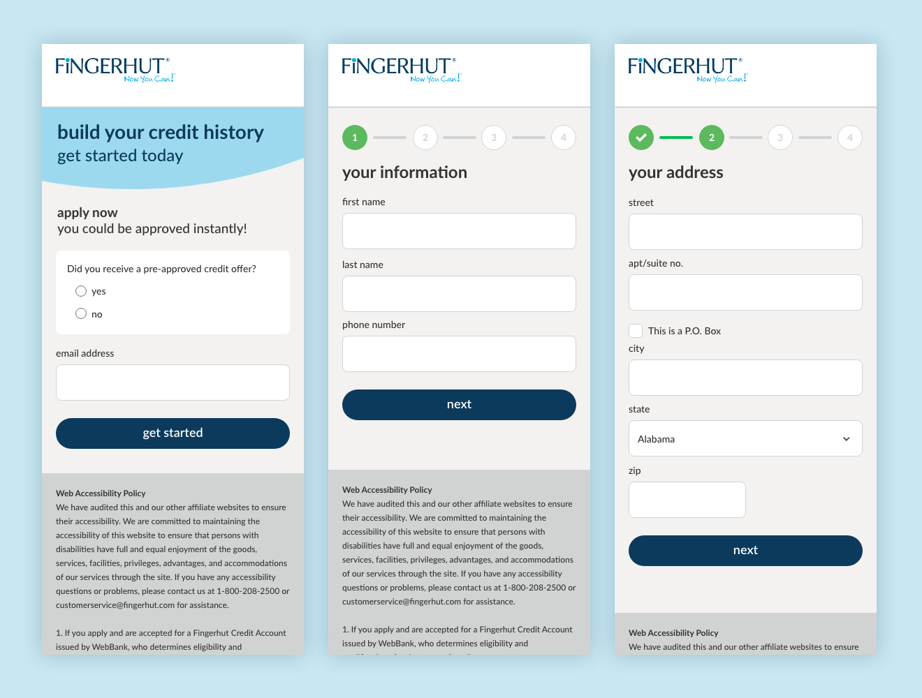
Used Adobe XD to create wireframes and high-fidelity mockups of a multistep application.
- Broke the application into well-defined, well-labeled steps.
- Wrote section titles that clearly explained what content was being asked for.
- Designed a status bar to indicate the current position in the process.
Test
Validating & Refining
- Worked with developers on building out a fully functioning version of the application.
- Conducted A/B test against current format, which increased application completion rate, but decreased credit insurance and paperless statement enrollment rate.
- Continued iterative testing to find optimal content grouping.